
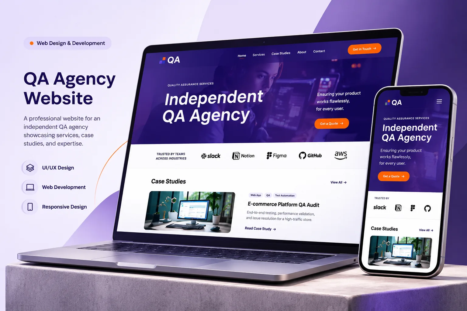
Project overview
This project was the design of a minimal, modern landing page for an IT company that offers independent QA services. The aim was a clean, professional interface that communicates expertise, with a strong visual hierarchy and a simple structure.
The problem
- The company needed a modern, minimal design that reflects technical professionalism.
- QA services had to be presented clearly, without overwhelming visitors.
- The layout had to balance simplicity with visibility of the services.
- Competing IT companies often used cluttered designs.
Goals
- Create a clean, minimal visual structure.
- Present QA services in a structured, scannable format.
- Show credibility through statistics and case studies.
- Keep strong call-to-action sections for business enquiries.
Who it is for
- IT companies looking for a QA outsourcing partner.
- Startups that need independent testing.
- Enterprises looking for automation and regression testing.
- Product teams comparing QA agencies.
How we approached the design
- A minimal layout. Large typography and white space for clarity.
- Service categories. QA services divided into clear sections such as automation, mobile, API and accessibility testing.
- A case study section. Sample QA projects shown to build credibility.
- A tools section. The testing tools displayed to reinforce technical authority.
- A strong call to action. A "Talk to our experts" section for lead generation.
Challenges
- Keeping a minimal look while presenting several services.
- Showing technical credibility without visual clutter.
- Structuring content for an enterprise audience.
- Balancing simplicity with business impact.
Outcome and impact
- A professional, minimal QA landing page.
- Clearer presentation of the services.
- A clear interface hierarchy and a clean layout.
- A conversion-focused, minimal design for an IT company.
In short
This project shows how well minimal design works in the IT industry. By focusing on structure, typography and a clear presentation of services, the landing page communicates QA expertise while keeping a modern, professional look.
It is the kind of work we do under UI/UX, Branding and Creative Design and website development. If you are planning something similar, tell us about it.